Hi. I'm Frederick.
I ♥ design, music & art.
This website is my resume. You're looking at my website. It's printable.
Frederick Brummer CV
frederick.brummer@gmail.com
LinkedIn↗
Graphic design, web design, typography, sketching, wireframing, storyboarding, Adobe Suite, Sketch, Figma, HTML/CSS, and more!
Key web, graphic and product design experience:
-
Freelance
Apr 2023 - CurrentDesigner / Consultant
View details
In 2023 I returned to freelance work. My work focuses on web design, primarily as a sub-contractor to web agencies. I also provide consulting and other design services.
-
Yellow Pencil↗
Sep 2015 - Apr 2023Designer / Product manager / Associate Director of Design
View details
In 2015 I'd been working freelance for nearly a decade when my first child was born. I'd just started wondering about finding a more regular gig when Yellow Pencil recruited me out of the blue. I loved freelance but the timing was perfect so I dove right in. I loved Yellow Pencil, and wound up working there for many years. During my time there, I moved through a number of various roles: designer, design lead, podcast producer, product manager, product designer, and eventually associate director of design. I knew from my time as a freelancer that I enjoyed wearing many hats, and YP turned out to be a great fit.
One of the things I really enjoyed in my role as associate director was the opportunity to review and critique the work of my team – turns out communicating about design is a great way to learn about it. I learned a lot in this role. -
40 Listings↗
2010 - PresentCo-founder
View details
40 Listings is a website I started with my friends at Realty Ninja. At the time, we felt that most MLS real estate listings were overly complicated, requiring users to create accounts or subscribe to services before they could even see a listing. 40 Listings was conceived as a very simple and accessible alternative to the MLS searches of the time. For over 10 years now, the site has continuously garnered hundreds of thousands of pages views per month. While it's not a huge earner, I'm proud of the fact that we built it to address a particular problem, and it appears to be solving that problem for the people who use it. A modest success.
-
LiFT Studios
Oct 2008 - Sep 2010Designer/Developer
View details
LiFT studios was a small "boutique" design shop run by Haig Armen, who now teaches at ECUAD. I learned a lot from Haig during this time, as we worked on projects for local and world-reknowned brands such as Sid Dickens, Namaste Publishing, and the Emily Carr University of Art and Design.
-
Overmind Productions
2007 - 2015Principal
View details
Overmind was the freelance design company I operated from 2007 to 2015. I really enjoyed the variety of work, and the freedom to take on weird projects. During this time I worked on numerous web and product design projects, while also taking part in some rare opportunities, like sound art installations and architectural work.
-
Blast Radius
2012 - 2014Front-end Interface Development
-
Jenesys Buildings↗
Dec 2005 - Oct 2012Assistant Manager
View details
I started working for Jenesys doing design work on a freelance basis. Over time my role became broader, and I became involved in all areas of the business. I designed all branding, print, digital, and trade show materials, and also assisted with product and business development. I even helped design and build some buildings.
-
Apple Tokyo
2006Director of In-house Web Design Team
View details
As director of in-house web design at Apple Tokyo, I managed a small team of web designers and developers as we implemented localization for new products and services, as well as developed original promotional content for the Apple stores in Japan.
Portfolio
Check My Ads Consultation, design and production
Situation:
Since 2023 I have been working with Check My Ads, a non-profit watchdog focused on advertising transparency, providing ongoing design support. This includes creating artwork for articles, social media posts, and extending the brand across a variety of touchpoints, including slide decks, report templates, and merchandise. The challenge is balancing the fast pace and shifting priorities of the organization while maintaining a cohesive brand identity.
Task:
My role is to evolve and extend their brand system and visual language to support their growing needs, ensuring that all design work—from digital media to print—stays aligned with their mission and is adaptable across formats.
Action:
In addition to managing a steady flow of ongoing media production—such as cover art for articles and social media posts—I’m also responsible for pushing forward on longer-term projects like brand documentation, document templates, and refining other key brand assets. This requires consistent collaboration with the team to ensure all visual materials remain cohesive, useful, and reflective of their mission.
Result:
The brand continues to grow in visual strength and consistency across multiple platforms. My work helps communicate their core message in a clear and compelling way, reinforcing their impact in the industry.


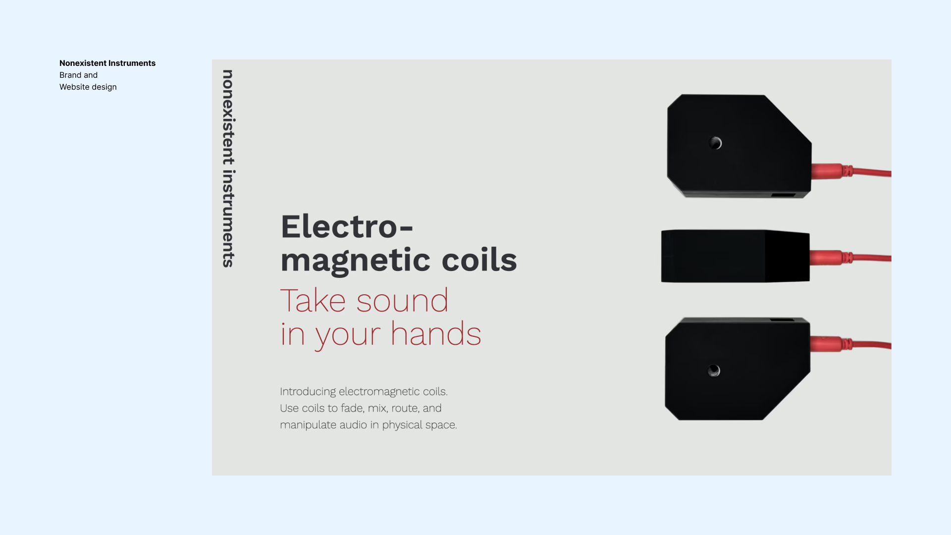
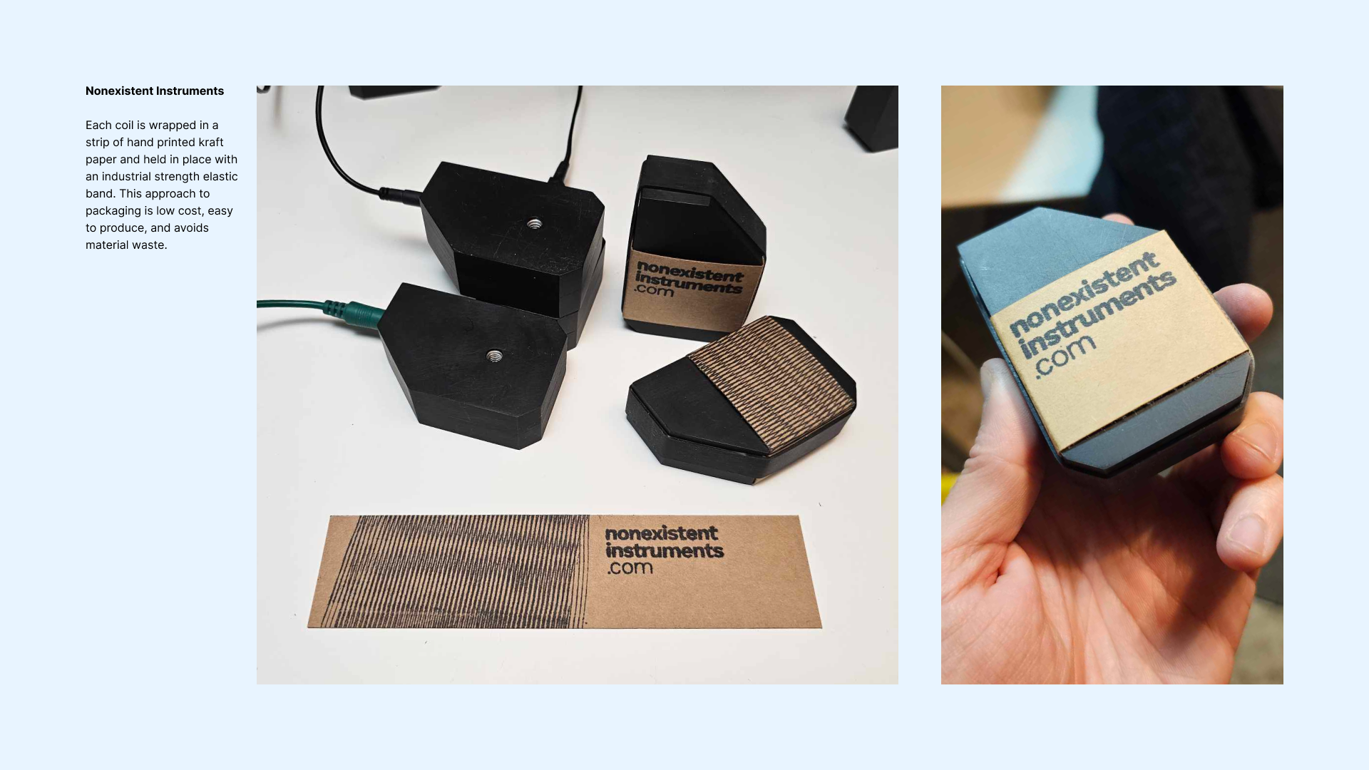
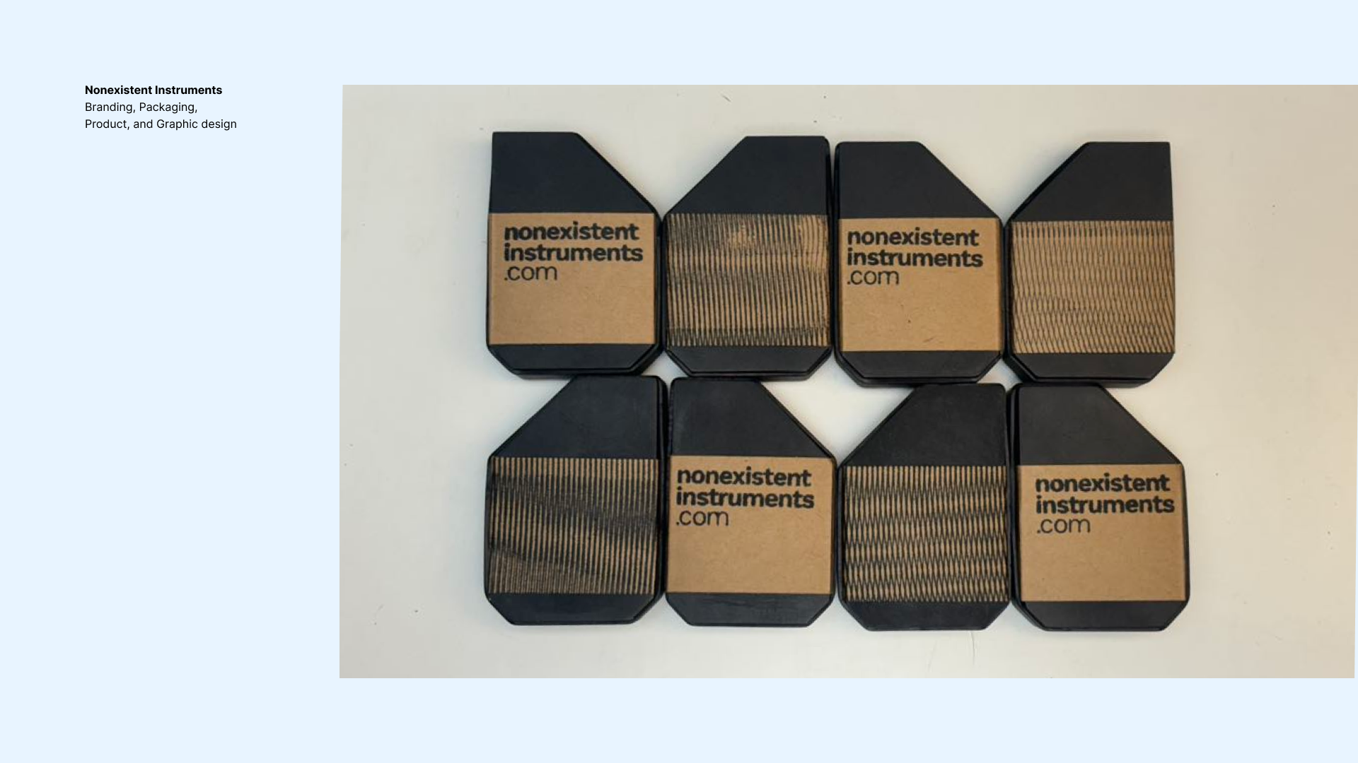
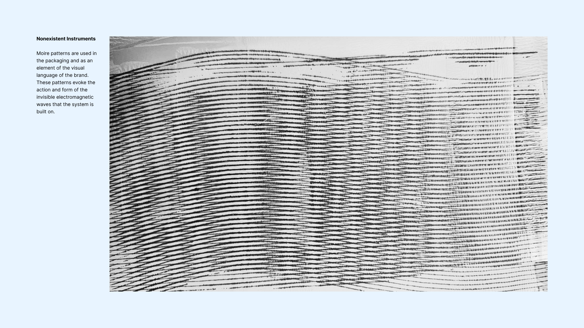
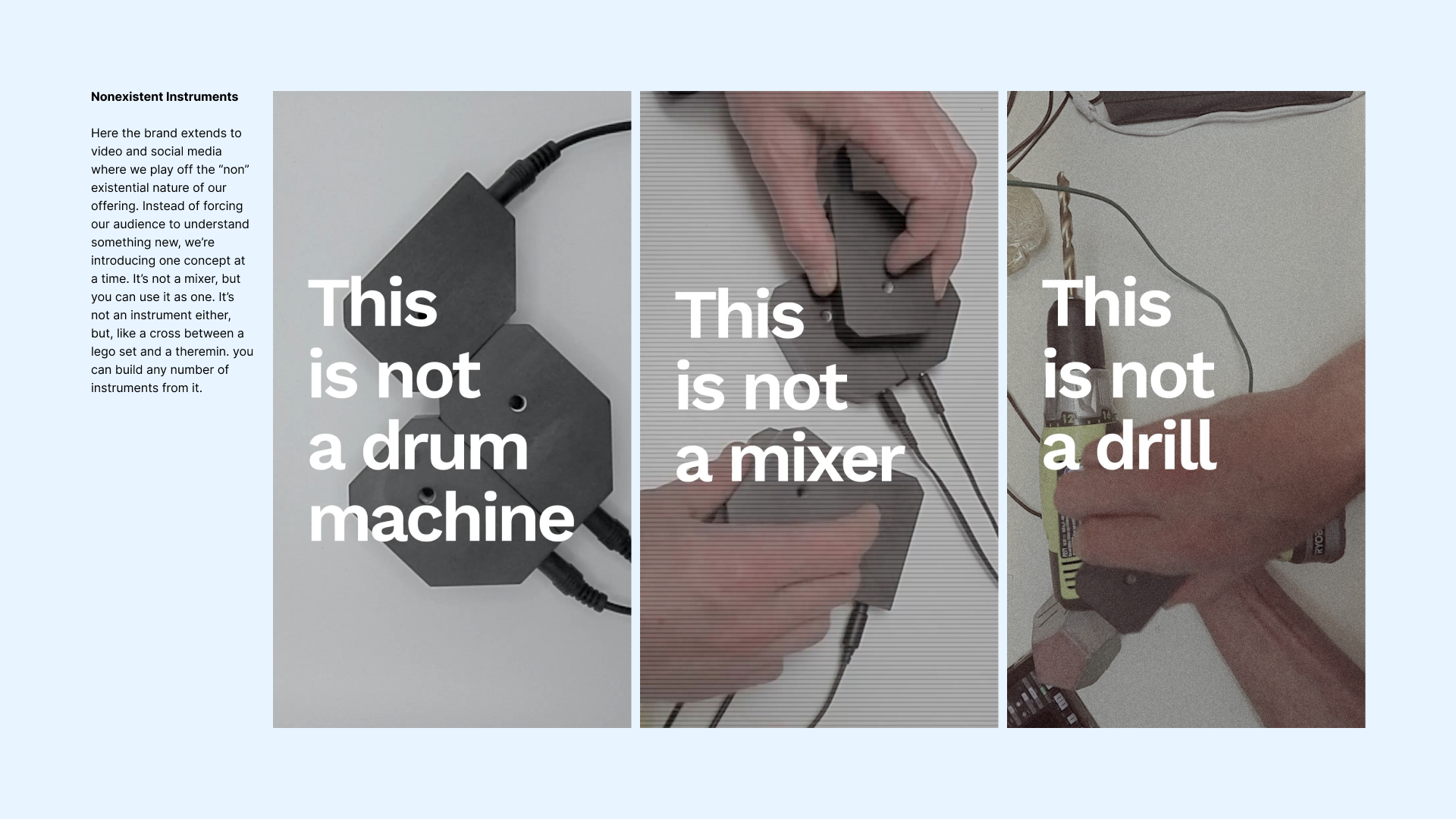
Nonexistent Instruments Branding, Packaging, Product, and Graphic design
Situation:
This project grew out of a shared vision between myself and my business partner, Ron Luther, to create more immediate, embodied forms electronic music. My background as a musician, starting from my youth playing instruments like the electric bass, inspired a long-standing interest in tactile and responsive sound creation. In 2006 I began creating and presenting various invented instruments as sound art pieces. Ron, a specialist in physical product design, approached me about one of these pieces and we’ve been collaborating ever since. We co-founded Nonexistent Instruments to make and sell the
fruits of this collaboration.
Task:
Our goal was to develop new electronic instruments that are as tactile and intuitive as traditional electro-acoustic instruments. We wanted to challenge the abstraction found in most electronic instruments, and find more direct and physical ways to interact with sound.
Action:
Our process is deeply collaborative, leveraging both of our strengths. We started product development with experimentation and prototyping. Ron focuses on the physical product design, while I handle graphic and web design aspects of the brand. We also frequently provided input on each other's work, which invariably improves the output. Together, we’ve discovered and developed several new forms of instruments.
Result:
Our current focus is a product called “Coils”, a system of simple electromagnetic coils that allows you to manipulate sound in physical space. We are now on the cusp of launching Coils to the public. We’ve received our first oder and are just about to enter production in earnest.
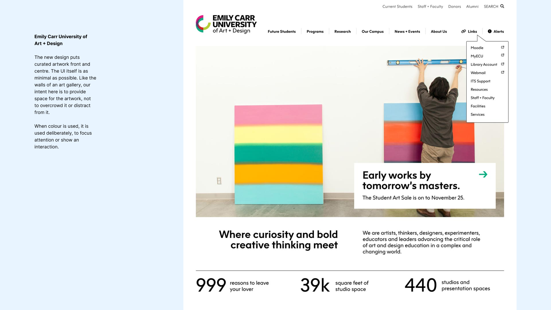
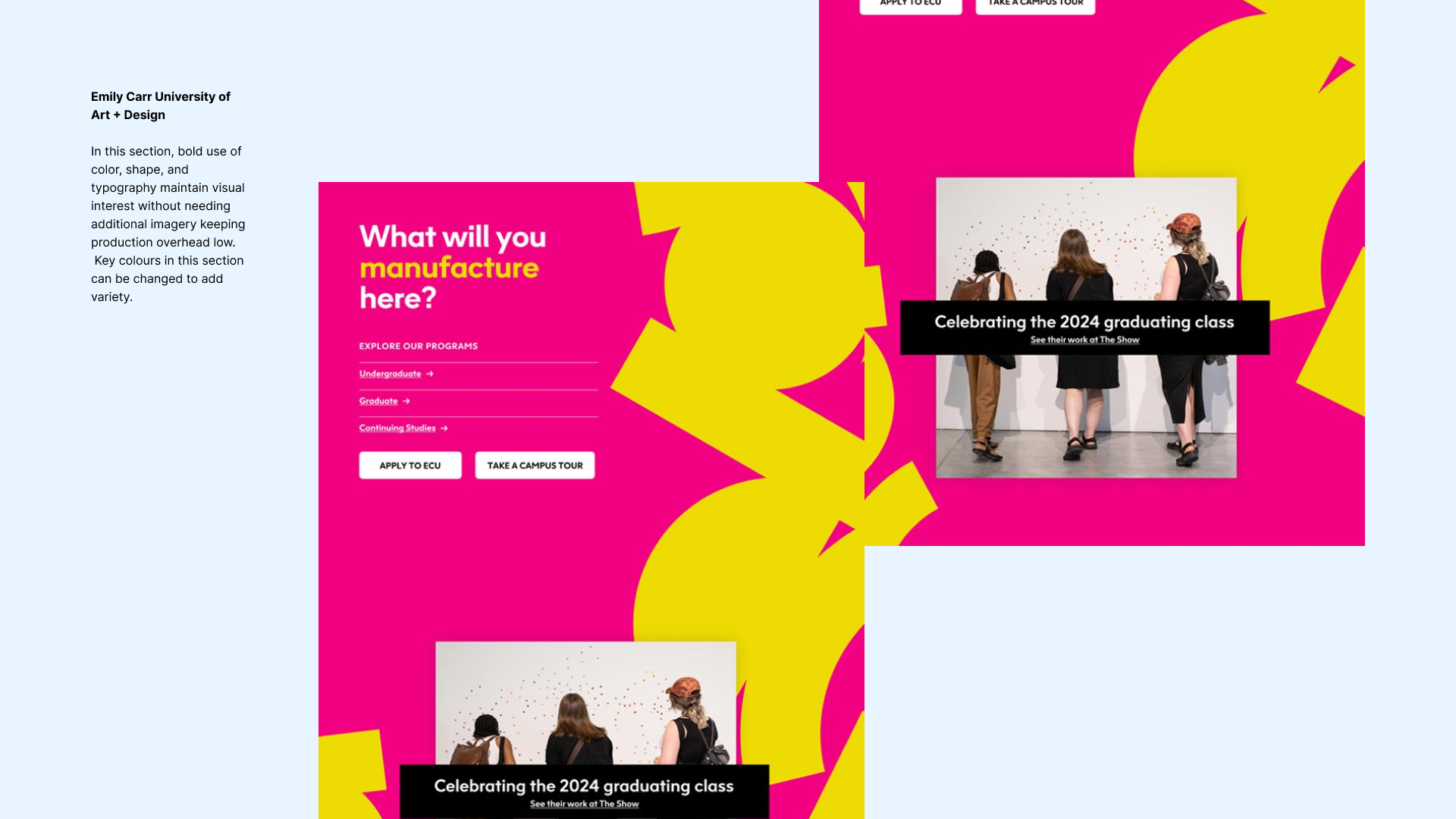
Emily Carr University of Art + Design Web design
Situation:
Emily Carr University needed a new homepage that was less work to update. They also needed it to show their updated brand. Their existing homepage had a complex layout, which made updating content cumbersome. With new regulations limiting the intake of foreign students, the university had to refocus its efforts on attracting local students. Research had shown that both prospective and current students wanted to see more artwork by faculty and students featured prominently on the site, increasing the need for a visually engaging design that would showcase the creative work coming out of the university.
Task:
Our task was to simplify the homepage layout while also reflecting the university’s new brand. The design needed to prominently feature student and faculty artwork, while communicating key information for all site visitors—particularly prospective students. We also aimed to make it visually compelling to better engage the local student population.
Action:
This was a collaborative design process between myself and long-time collaborator Ahmed Khalil. We were subcontracted by a local firm to do the UI design on this project, while they led the UX design and implemented the build. We designed a simple set of modular components that each reflected the university’s new brand and could be implemented not only on the homepage but in other key locations throughout the site.
Result:
The new homepage allows the university to highlight faculty and student artwork while making critical information easier to update and access. The flexible, modular design reduces workload for the university’s internal team, while aligning with their updated brand.


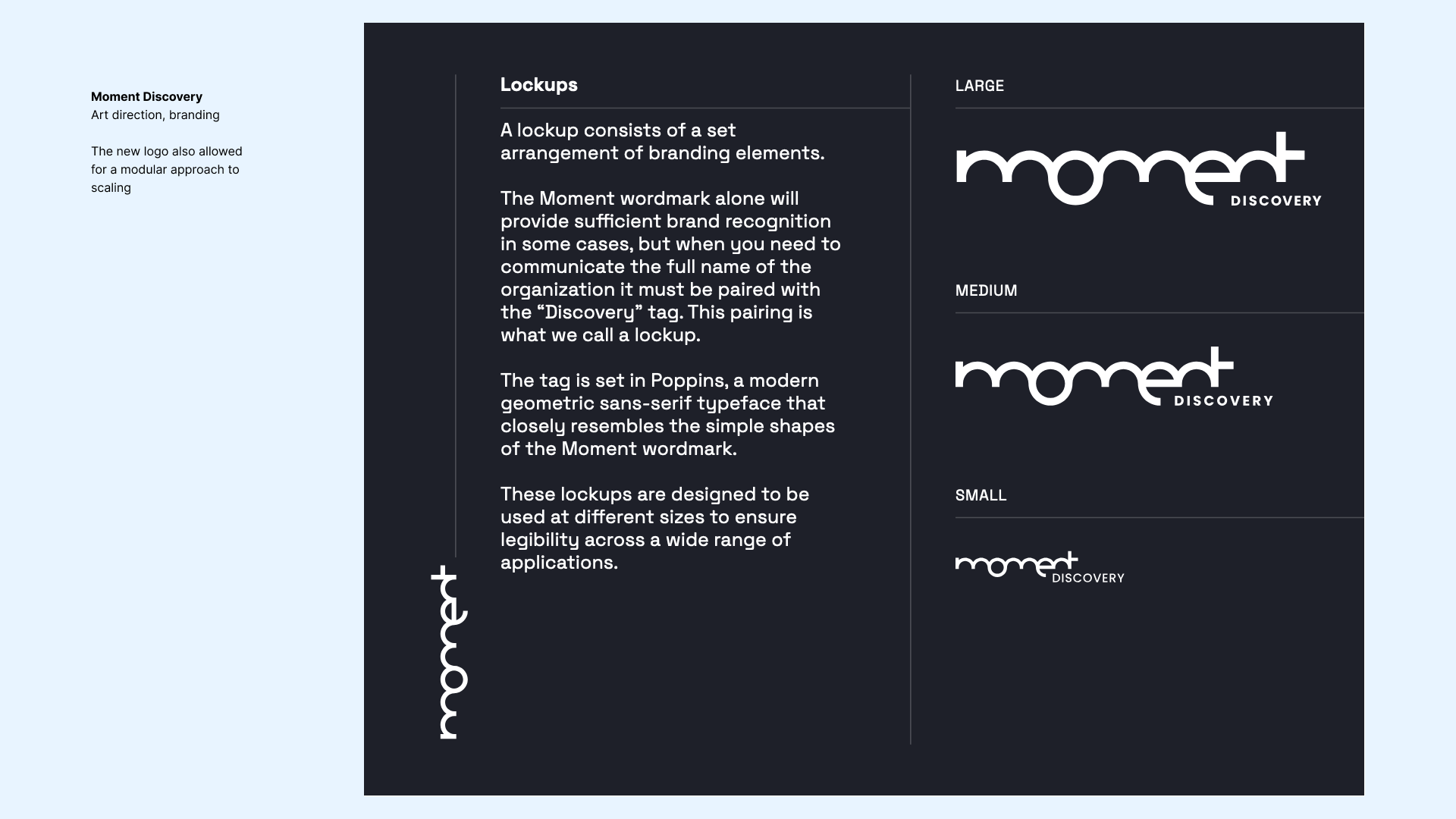
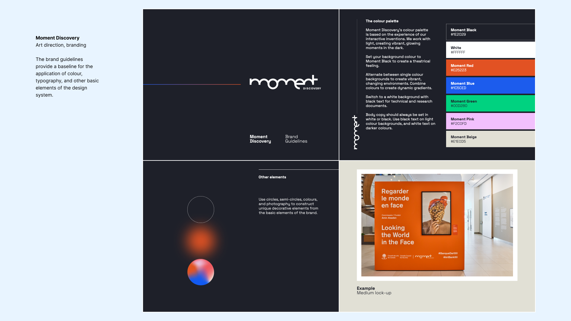
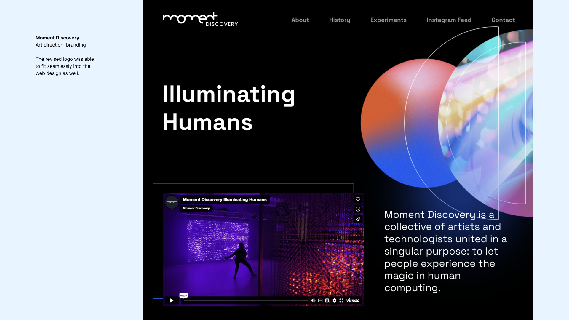
Moment Discovery Art direction, branding
Situation:
Moment Discovery makes digital interactive artworks. Moment needed an updated brand and website to support an upcoming grant application. Their existing brand consisted primarily of a badly pixellated logo from a bygone era. Meanwhile, they had limited time and budget, so we recommended they forgo a full logo redesign, replacing it instead with a simple word mark. The client agreed and we proceeded with the project.
Task:
Initially, I was overseeing the project through weekly design reviews while one of our designers did the work. We were making good progress, and the client seemed satisfied. However, two significant twists occurred: the designer left for another opportunity, and the client suddenly expressed a strong attachment to their old logo, asking if we could incorporate it into the site very late in the process. This presented a challenge, as simply slapping the old logo onto the new site was not an acceptable solution.
Action:
Recognizing the need for a quick yet effective resolution, I stepped in to develop a solution that would allow the client to retain the essence of their old logo while updating it to fit the new branding. I designed a new logo that maintained continuity with the original while presenting a cleaner and more modern look. In addition, I extended the work left by our departing designer into a comprehensive brand system and set of guidelines to ensure consistency across all materials.
Result:
The outcome was an updated brand and visually cohesive website that effectively represented Moment Discovery’s mission while accommodating their existing logo in a refined manner. This updated identity enabled them to better engage their audience and supported their efforts in applying for the grant.


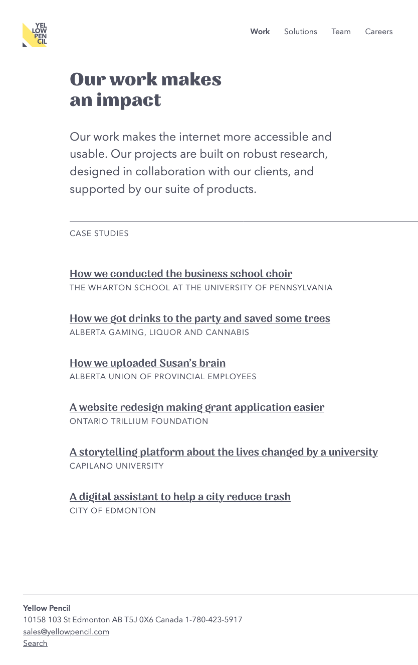
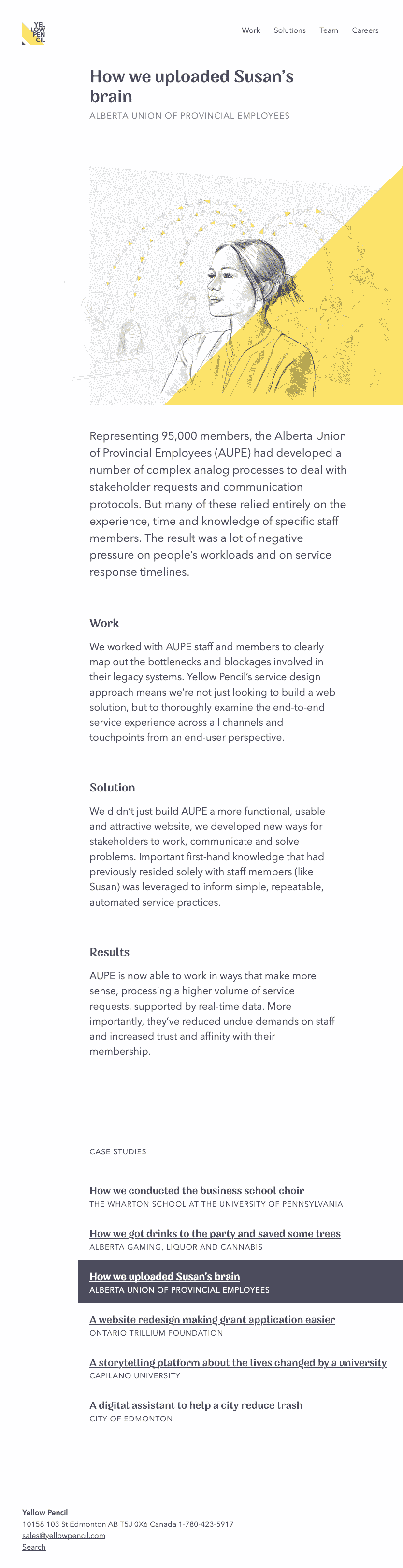
Case studies
Yellow Pencil website
Role(s): Design: w/ Creative Director Ahmed Khalil
Front-end development: html, css, javascript, static site built on Jekyll
Highlights: Content first, typography forward
Minimal navigation pattern
Collaborative, iterative, in-browser design/build
Robust responsive design system
Background: I worked at Yellow Pencil (YP) for nearly 8 years, from September 2015 to April 2023. When I started, YP was a completely flat organization, and my role was simply "Designer", like all the other designers.
Over time the organization grew, and I grew with it. I took on product manager, product designer, and eventually Associate Director of Design roles. One of the things I did in this role was to pick up design tasks that weren't related directly to client work. One of those tasks was to remake our company's own website.
Approach: We'd been struggling to find the time and resources to get our site updated, and it occurred to me that we might be taking the wrong approach. At the time, then Creative Director Ahmed Khalil had been working on designs for the new site, which were beautiful and elegant, but we were having a hard time getting the project to move forward. We'd been following a "waterfall" kind of process, where Ahmed had to finish all the designs which were then to be implemented by a contractor.
The process meant Ahmed had to design every page and pattern at every size to give the developer enough information to build the site well. A gargantuan task to complete on top of a busy schedule.
The developer would then be overwhelmed with design details, making it difficult to build the site at the same fidelity as the mockups.
The process involved a kind of rework. First Ahmed had to define a design system and implement it graphically. Then the developer had to re-interpret that design system as code and implement it again – accurately.
The distance between design and the front-end development work was making the whole process more difficult. They needed to be closer together if we wanted to get quick results.
So I proposed that Ahmed and I work on a new design together, take a simpler approach, and design it in the browser as much as possible. The idea was that if we could design it in-browser, by the time the design was done, the development would also be done. This meant we'd be able to deliver a product much more quickly.
This approach turned out to be a success. We started by launching a "Minimum Viable Product" of the site and then iterated on it from there.
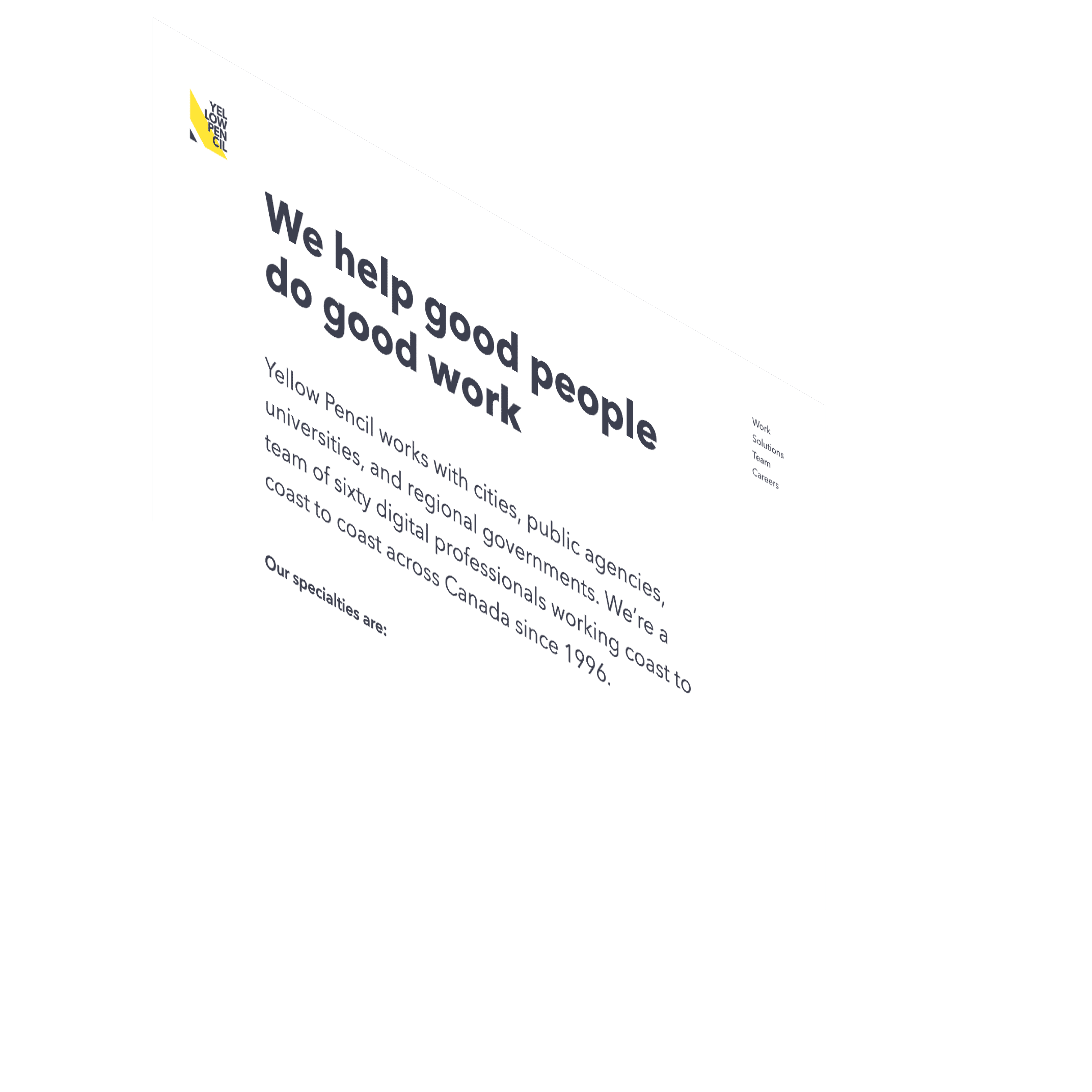
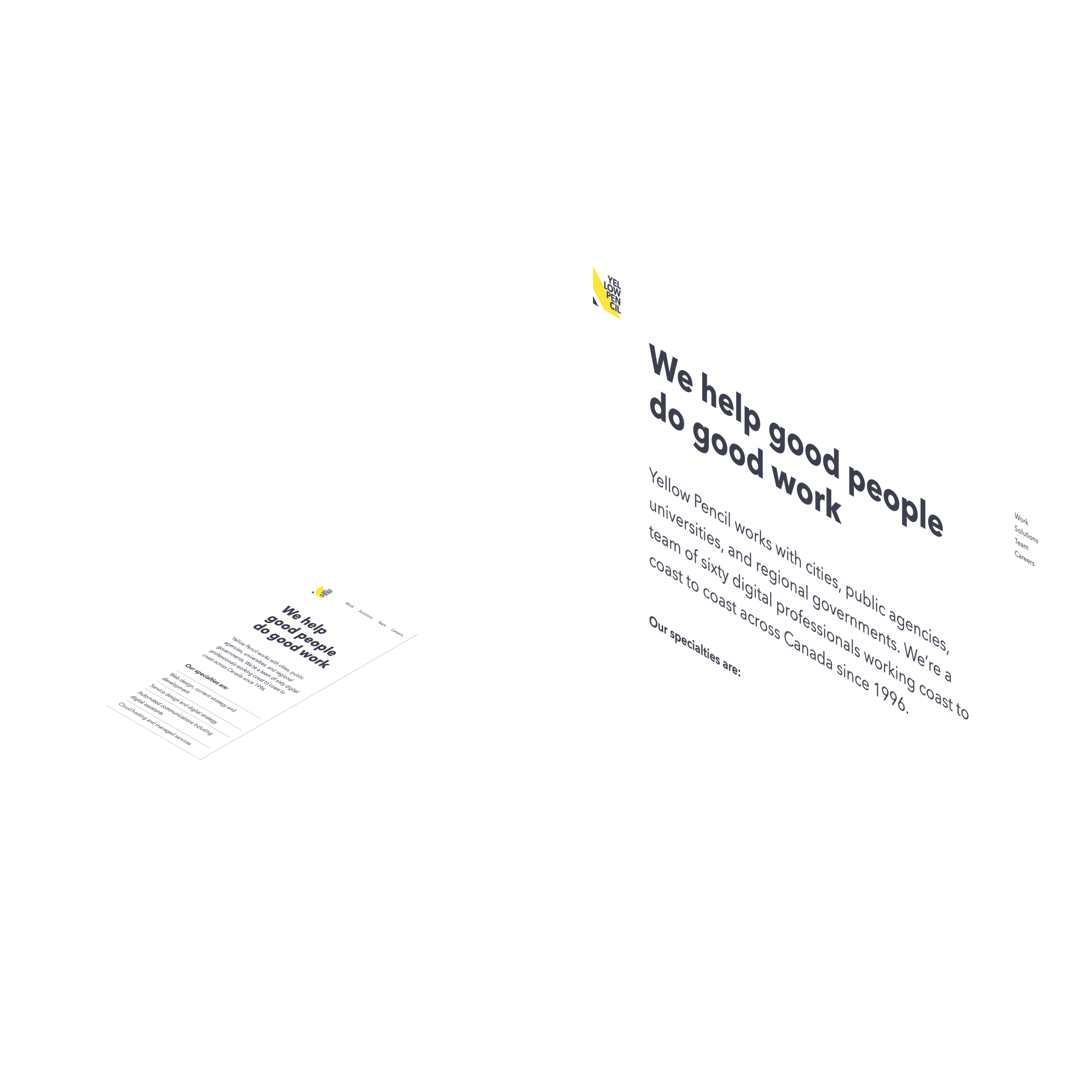
The Yellow Pencil website focuses on clarity.
Content first: Yellow Pencil's work is based on a strong content design practice. The content for the new site was developed before the design work began, then further refined throughout the process. The content was also the primary focus in our approach to the visual design of the site. We did this by basing our design approach on typography. Typography is very useful for the clear presentation of content.
It's also useful for achieving other design goals such as usability and accessibility. Good typography brings an aesthetic value to text that is often lacking on the web. And much of the web is text. We wanted our site to look great without relying on flashy banner images. We did away with any unnecessary UI elements. We went type-centric, instead of UI-centric.
Minimal navigation: It's rare to have license to experiment with navigation patterns. Both client- and service-side teams have a strong expectation for the conventional approach. I have an opinion about the ubiquitous global navigation UI pattern seen on every site ever :
it doesn't need to be at the top of every page. We easily package it all up under a "hamburger" icon on mobile devices, and no one seems to mind. And when we're on desktop we have even more places to put it. I like to put navigation at the bottom of the page. My assumption being that people may want to read the page they're on before going somewhere else. They may even need to read it before knowing where to go next. Main navigation can comfortably sit in the footer on desktop sites. You can put a "menu" anchor link in the header to send users there when they need it.
I know, I know, it's backwards, at least from the conventional perspective. Here are some counter points:
- Books have a table of contents in the front of the book, not on every page. It doesn't really have to be on every page if there's an easy way to get to it.
- Complex headers consume a large amount of energy and resources. They are costly. First, designing and implementing them takes a lot of effort. They are over-crowded with functionality, branding, drop downs, megamenus, log ins and alerts. So that's one kind of cost: design / development.
- But it costs you something even more dear than design and development time: attention. The more things you put in your readers' eyes, the less they'll see any one of them.
- Complex header navigation systems can also be fragile. Often adding one more navigation element causes the whole layout to break.
Good design requires managing complexity : visual complexity and interactive complexity. No one can actually navigate your complex header and read the page at the same time. There's no reason to show them both at once. Make it modal. Do one or the other. Go into nav mode. Put the nav somewhere else, like maybe a full sitemap on the homepage (kinda like craigslist?). There are so many ways you could go that don't involve putting a hundred elements in the top inch of the screen. It is nice to have easy access to navigation from that top bar, but we don't need to show it all at once.
See? That's how I get about this stuff. I rant. I wax philosophical. I care.
But I had a point I was getting to: because it was our own site we had license to make decisions. So we were able to innovate in our approach to the navigation.
We did three things here. First, we kept our main navigation items very limited. Just four. This allowed us to keep those four elements in a more-or-less conventional location at the top right of the page where they're easy to find. We did not extend this system with any kind of sub-navigation, flyouts, etc. We kept it simple: Work, Solutions, Team, and Careers.
To navigate deeper into the website, a user landing on the home page would first have to enter one of those four areas. Content on the home page also directs users to each section of the site, introducing each in turn. Each of these four areas has its own landing page. These pages contain relevant content and a menu of links that take the reader deeper into the site.
For example, from the Work page, the reader can choose from a menu of case studies about past work. This same menu is then displayed again at the bottom of each of the case studies. This approach merges content and navigation into a single system. It encourages people to engage with the content, and it puts navigation in a place where it makes sense.
We also implemented our very own OnPoint Search, which further addresses the perceived need for a big nav bar. If people are looking for something specific, they can search for it. If not, the site will lead them to it.
Responsive design: The Yellow Pencil site design works from the smallest device sizes up to the largest desktop monitors, that's a range of 320px to 2560px, and beyond.
Responsive design is a technology that allows us to optimize design systems for different viewport formats. It was popularized around 2012, when the biggest screens on the market were 1280px wide.
Today, over ten years later, the landscape of devices has changed, but our approaches to responsive design have not. The most common viewport in use today is 1920px wide. Most "responsive" sites still don't respond above 1280px.
The screen I'm looking at right now as I write this is 2560px. That's exactly double the width most "responsive" sites cap out at. Double!
As a designer, I can't imagine ignoring half the space in any other medium.
I think this situation is no good. I'm on a personal mission to find ways to think about, design and build more responsive systems. And I feel I made significant progress on this mission with Yellow Pencil's site.
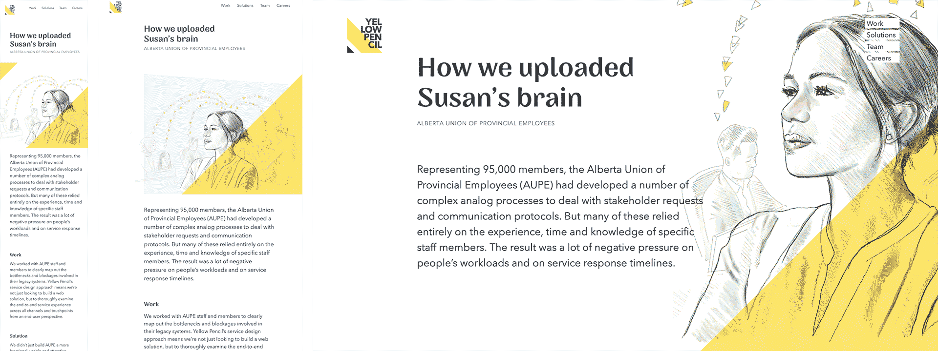
Responsive hero images: Another place we were able to innovate in the design of the Yellow Pencil website was with the hero images. One of the puzzles of responsive design is that text and images scale differently. Text flows, and can be "reflowed" into different shaped containers – narrow or wide – and still function reasonably well. Images are more restrained. Generally speaking, you can't change the shape of an image. If you pinch or stretch them they look weird, and cropping them can result in loss of important parts of the image.
The approach we took was to build a kind of "reflowable" system for the hero images. The main illustration conforms to a template with a "safe zone". This safe zone lets us crop the image in the front-end with confidence, because we know exactly where the important subject matter in the image will be. Imagery within the safe zone is always shown. When there's enough room , we show more of the illustration. Shapes and layers can be added or removed to balance the composition of the image with the layout of the page.